|
My commerial is about JT's glasses. The glasses are all about the future and what it will bring. The commercial shows a example where if you don't have the glasses what could happen and what danger you could be in, and than the glasses would help in those dangerous situations. Also talks about what the glasses can do in gneral and compares to what they are like.
0 Comments
Here is the logo I redid. The one at the top right is the old logo for the Mighty Ducks. When I redid this logo I made iy with the colors the team are today which are orange, black and a gold. I based it off of Donald Duck who is a Disney Character and the movie The Mighty Ducks is a Disney movie. I used the goalie mask as well from the old logo. I did the half circle to show how they have it on there Disney logo as well. His feet show the old time hockey as well as the gloves and the helmet.
My Logo Well the original logo was the London Taxi Company, and I changed mine as The First Digital Glasses. The logo shows and eyeball since there glasses. Inside the logo it has what the product is and than saying the company founder in the middle. Also the name of the glasses. Than we have the five stars that show what kind of company it is and how it is rated.
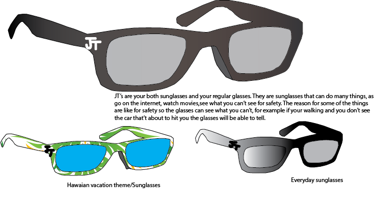 They are sunglasses that can do many things, as
go on the internet, watch movies,see what you can’t see for safety. The reason for some of the things are like for safety so the glasses can see what you can’t, for example if your walking and you don’t see the car that’t about to hit you the glasses will be able to tell. 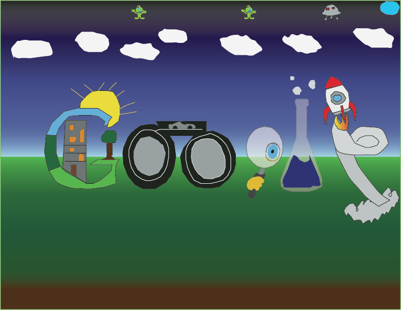 For my google design I wanted to make it things you would see in the future or to inspire. For the G I did a house inside the G because I wanted it to represent new things, so for inside it I made a house that is different. As you can see the windows are different from each other and the house is a different shape. This is showing that you can do anything you want and you can be different from each other. For the two O's I did a racetrack with a car, because the cars in the future will be different and we don't know what they will do. So instead of a regular track I did a different kind for the future. For the g and the L I made it for new discoveries in the world that the future will tell. For the e I made it so the rocket ship would look like the e from the smock it provides. Than the rocket ship than shows new discoveries in outer space and new discoveries we will make.
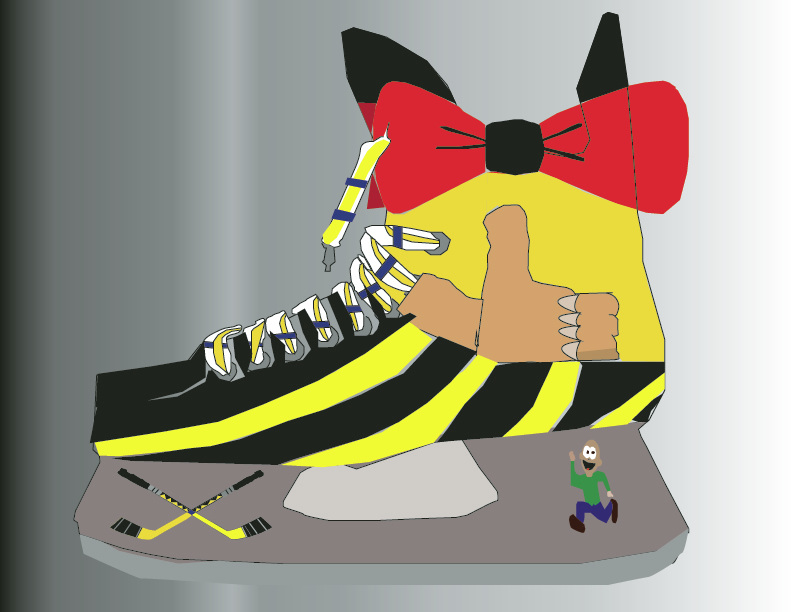 This is my branding design. Our class was supposed to make a shoe (as I picked a hockey skate) that represented me. What I did for each design I did a picture that represented me. For classy I did a bow tie. As myself, I like to be someones who is classy and is looked out to be classy. I thought the bow tie represented that, because it looks classy or when you see a bow tie you think of it as classy, because you don't see many people wearing them unless there trying to look classy! For the thumbs up I did confident. I choose that, because it shows confidence when you see a thumbs up or good job, which gets you motivated than leeds to confidence. For the two hockey sticks I choose passionate. I choose that because when I play hockey or another sport i'm passionate at what i'm doing and that shows how much I love the game or games. Which to me the sports I play I am passionate about. For the guy running, I choose driven. I thought it represented it well because, wen they guy is running he is driven and is focused on what he needs to do.
|
